
One URL.
Every useful view.
Use the mobile website viewer to test a public page at phone, tablet or desktop widths. Open a report for rendering, search appearance, page speed, DNS and SSL.
Previewing is instant and starts no audit. Choose an in-depth look whenever you want a detailed website report.
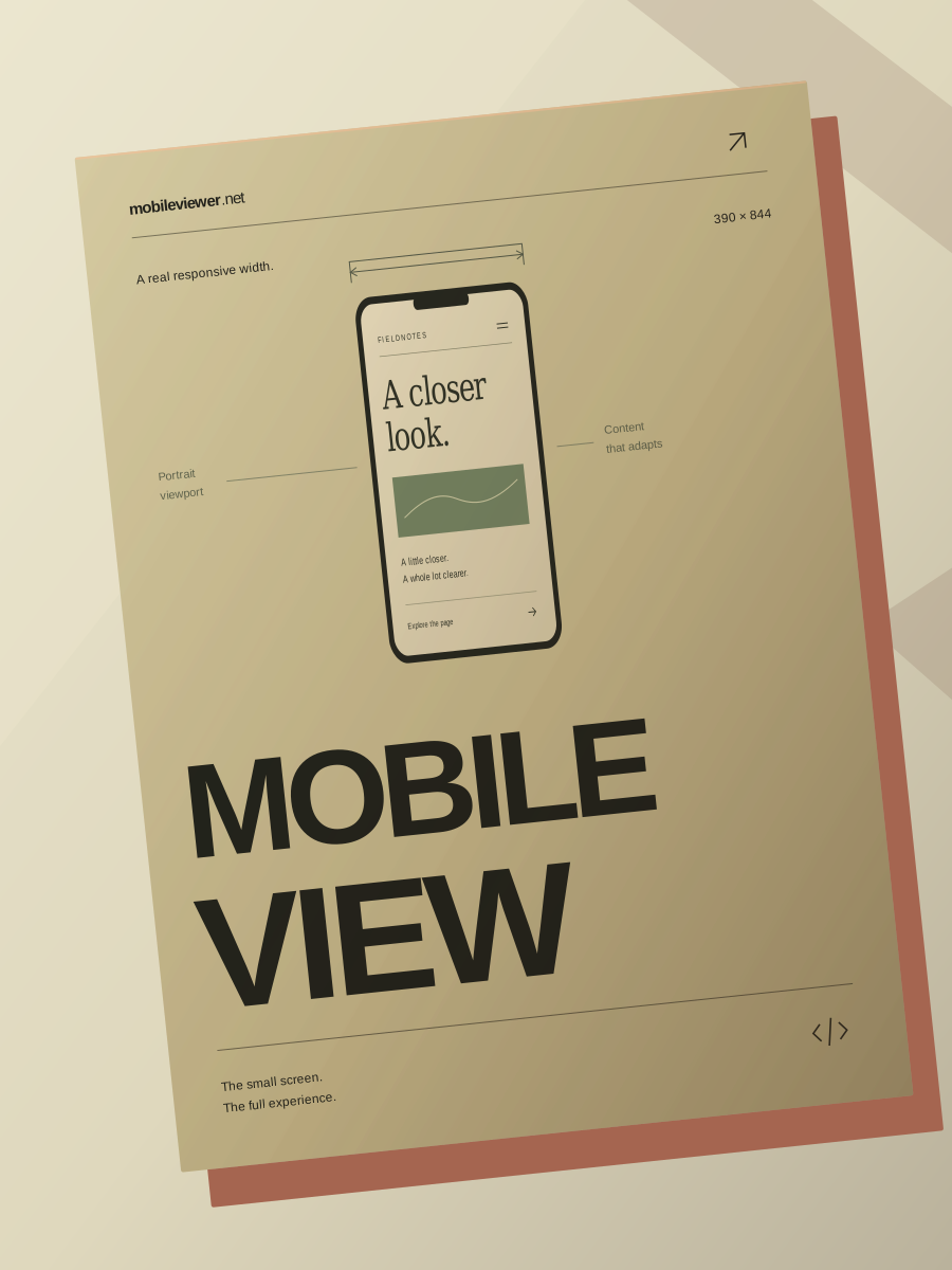
Mobile View 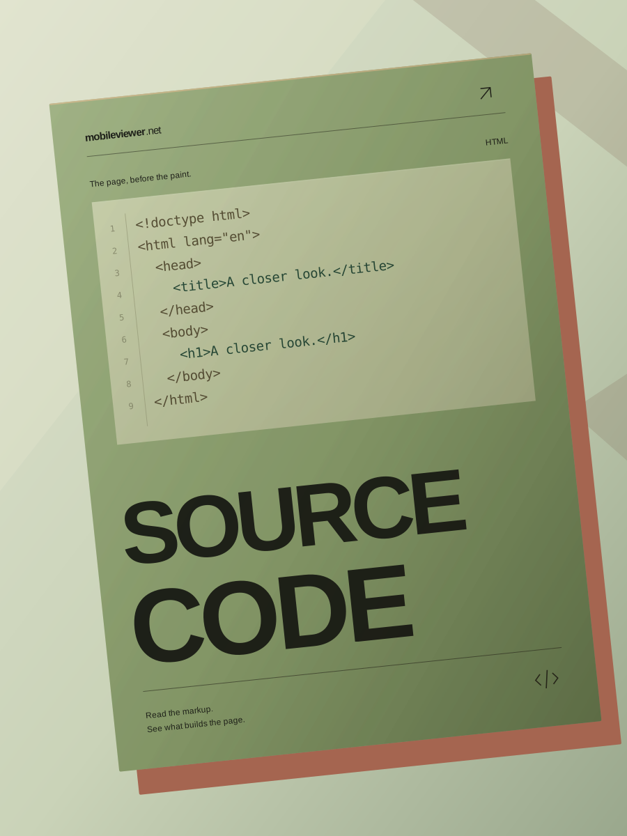
Source Code 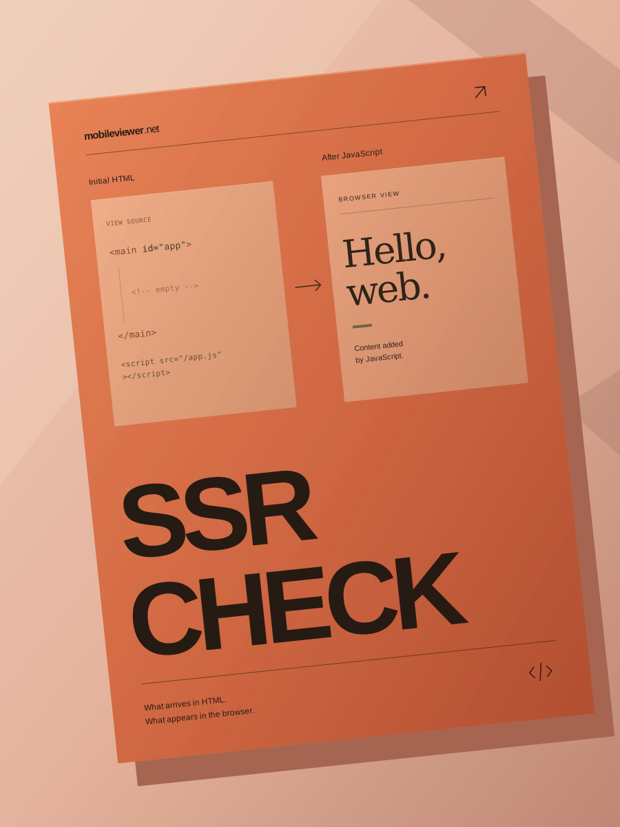
SSR Check 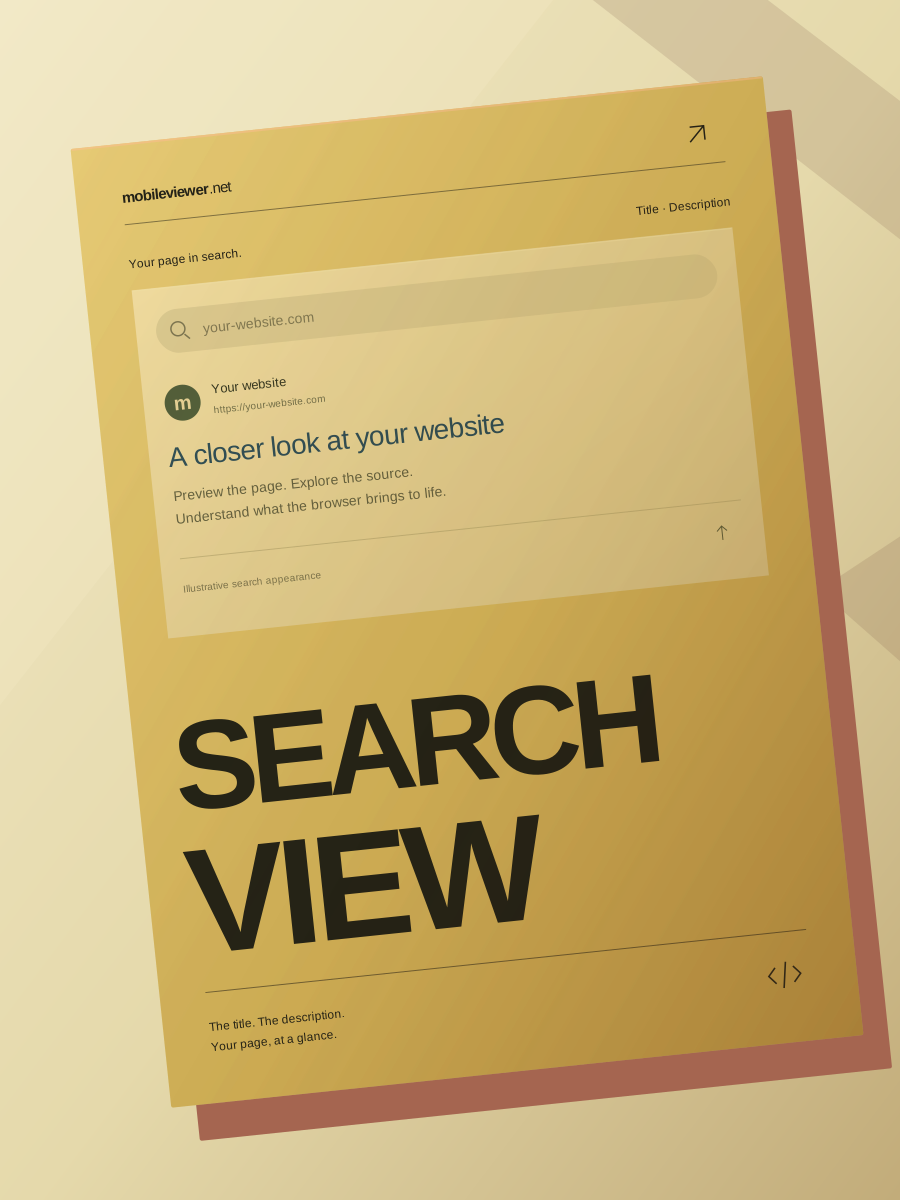
Search View 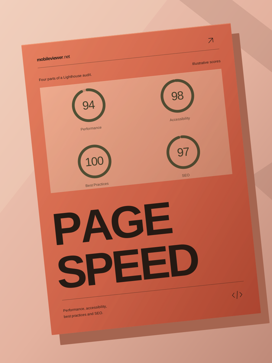
Page Speed
Confirming creates a public report and queues its full analysis.
Mobile rendering. Search. Speed. What powers the page.
A closer look.
A clearer picture.
From the small screen to the source code.
Explore the signals that make a website work, together.
 Mobile viewSSR checkSearchPage speedYour report
A trail of
fresh perspectives.
See what other visitors have looked into. Open a recent report to explore its mobile views and website findings.
MobileViewer brings
the whole page into view.
One place to see how a website looks, loads and renders.
Built for the questions a simple preview leaves behind.
More than
meets the eye.
Follow the page from its first response to what the browser renders.
Browse fonts by category or source. Preview text in the available styles, inspect the character set, and find download details on each font page.
More than
meets the eye.
Follow the page from its first response to what the browser renders.
Browser-based controller diagnostic tools for stick drift, input timing, button response, and more, plus the GPADLAB-defined Controller Health Score benchmark. 25+ free tools, no download required.

One website.
So much to discover.
See how it looks. Find what powers it.
Understand what search engines see.
How to test a website on mobile
Start with a specific page, such as a product, article or landing page. The same site can behave differently from one page to the next.
Open the mobile viewerCheck the layout at a narrow width
Paste the URL, choose a phone viewport and open the preview. Look for text that runs off-screen, menus that cover content and buttons that are hard to reach. Rotate the viewport or switch to tablet to see where the layout changes. This tests how the page responds to screen size in your browser.
Compare the source with what the browser renders
Choose Take an in-depth look to request a public website report. The rendering check compares the initial HTML with the page after JavaScript runs. Search appearance shows the observed title, description and canonical, alongside available structured data, robots.txt and sitemap findings.
Read the speed and domain findings together
PageSpeed Insights measures a mobile lab run. When Chrome UX Report data exists, it reflects real visits over a reporting period. Use the report date to put both in context. Domain findings bring DNS, SSL certificate details and detected CMS or framework signals into the same report.