About Mobile Viewer
Home / About
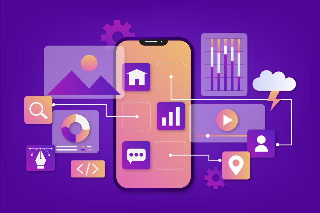
Your Mobile Testing Partner
Who We Are
Mobile Viewer was born from a simple frustration that every web developer knows: spending hours wondering if your website actually works on mobile devices. We’re a team of developers, designers, and digital marketing professionals who got tired of the guesswork and decided to build something better.
Since launching our mobile responsive testing platform, we’ve helped thousands of website owners, developers, and digital marketers ensure their sites deliver exceptional experiences across all mobile devices. Whether you’re a freelance developer working late nights or part of an enterprise team managing dozens of sites, we understand the challenges you face.
What We Do (And Why It Matters)
Your website visitors aren’t just browsing on desktop computers anymore. With over 60% of web traffic coming from mobile devices, a broken mobile experience means lost customers, reduced search rankings, and missed opportunities.
Our mobile testing tool provides instant, accurate analysis of how your website appears and functions on popular smartphones and tablets. But we go beyond basic screenshots – we test real functionality, loading speeds, and user interactions to give you the complete picture of your mobile performance.
Services
Our Core Services:
Instant Mobile Device Testing
Test your website across multiple device types and screen sizes in seconds, not hours. See exactly how your site appears on iPhone, Android, tablets, and other popular devices.
Real-Time Responsive Analysis
Our responsive website checker identifies layout issues, broken elements, and performance problems before your users do. Get detailed reports on what's working and what needs attention.
Performance Monitoring
Track loading speeds, identify slow elements, and optimize your mobile experience for better user engagement and search engine rankings.
Accessibility Compliance
Ensure your mobile site meets accessibility standards and provides a great experience for all users, including those using assistive technologies.

Why Choose
Mobile Viewer?
Always Up-to-Date: We continuously update our testing capabilities to support the latest mobile devices, operating systems, and web standards. When new devices hit the market, we add them to our testing suite.
Built for Real Workflows: Whether you’re doing a quick check before launching a campaign or conducting comprehensive mobile audits for clients, our tools fit seamlessly into your existing workflow.
Accurate, Reliable Results: We use real device rendering engines and testing environments to ensure the results you see match what your users actually experience.
From Startups to Enterprise: Our platform scales with your needs. Individual developers love our simplicity, while large teams appreciate our advanced reporting and collaboration features.
Our Mission
What We Offer
Ready to Improve Your Mobile Experience?
Join thousands of developers and businesses who trust Mobile Viewer for their mobile testing needs. Test your website’s mobile responsiveness today and discover how small improvements can make a big impact on your user experience and search rankings.
Start your free mobile test now – no signup required, instant results guaranteed.